Hi guys! Been busy,
busy! Not really? Yeah kinda. Anyway. For Lesson 4 we learned a
new really cool
technique! It's like painting but…Painting digitally! xD
When it comes to
rendering in Photoshop, I or a lot of people usually use a soft brush
to color in pictures
for a soft gradient look~ I, once upon a time~ used to do this too~
That look can look
good, but can make the image look pretty flat in a way~
So this technique is
used to back-up that as well as giving it a better form as well.
So basically,
imagine we're painting in real life, and all we have are two different
colors - red and
yellow. By using the color pick tool (using the alt key is ultra handy!)
we can quickly
select any color on the canvas (so like switching from red paint to
yellow paint) and
paint over color over color! Like paint!~
Quick demonstration;
we have red and blue, color pick the blue and paint on top of
the red. You'll have
a slightly altered shade of blue on the red: color pick the new
shade on the red and
apply to the blue side! From there do the same from the blue
to the red! Easy as
that! Getting used to color picking can take awhile but.
When I saw and tried
it for the first time, I was so slow! But after an hour, you'll
get the hang of it
easy! It's all about rhythm! Here was my first time doing it! :D

The red blue
combination doesn't actually look as good, but my teacher used the
same example! xD And
his didn't look as good either! (No offence sir!)
And see that nose
like thing there? That was made from 3-4 colors~
Pink, yellow, and
black and white~ Pretty ok for a start I rekon. Anyway,
since the technique
is pretty like painting applying paint over paint, there's not
that much to say
about it~
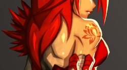
So, pretty much do
everything from the start of the last lesson up to the overlay
part. I actually
didn't expect this image to look any good since I rushed those first
few steps pretty
(PRETTY) badly. But as soon as I the rhythm of applying paint
started, I got
movin' and the next thing I know was pretty much done…
Doesn't take that
long at all! And there's nothing to is as well. Here's the first
three steps, to the final:

First three steps...

Final. (Click here for Full Resolution)
On the alternative,
because I didn't think it'd end up looking good, I was working
on another piece at
the same time! Although it didn't really help cause at the start
it looked pretty
horrible as well! Got better towards the end I think. Here!

So yeah, that's it
for now. Till next time! Bye!~